Production-Grade Design Systems: Key Takeaways
- A design system becomes production-grade when it is run as infrastructure with governance, not as a library of vetted components.
- Token architecture is the load-bearing layer. Get the token tiers right and theming, multi-tenancy, and dark mode become configuration, not rework.
- Component count is a vanity metric. The primitive-versus-composite split decides whether the system scales or fragments.
- The Figma-to-code sync pipeline is where most systems break. Manual handoff guarantees drift within a quarter.
- Governance, not headcount, determines whether a design system survives contact with multiple product squads.
A production-grade design system is an engineered system of design tokens, classified components, and a sync pipeline that keeps design and code in lockstep, governed by contribution rules. It encodes visual and interaction decisions as versioned infrastructure rather than a component gallery. The output is a single source of truth that multiple squads build against without forking.
“Production-grade” has a plain meaning in software: built to be relied on in live use, with the versioning, testing, monitoring, ownership and change control that implies, rather than something that works in a demo. Applied to a design system it means the same thing. The tokens are versioned data, the components ship through a release process, the sync between design and code is automated and someone is accountable for every change.
Why Most Design Systems Never Reach Production
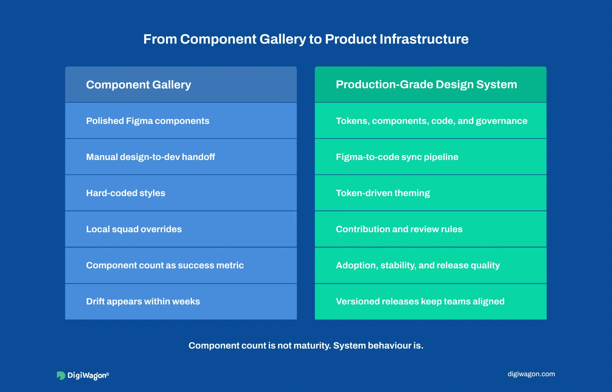
Plenty of teams build a design system. Far fewer build one that survives into production across multiple squads. The failure is rarely about component quality. It is about treating the system as a deliverable instead of as infrastructure that needs ongoing ownership.
Four failure modes recur:
- Component-gallery thinking. The team ships 80 polished Figma components, declares victory, and watches them drift from the codebase within two sprints because nothing keeps the two in sync.
- No token layer. Colours and spacing are hard-coded per component, so a brand change or a new tenant theme means touching every component by hand.
- Undefined contribution rules. When a squad needs a component the system lacks, there is no path to add it cleanly, so the squad forks a local copy. Multiply across squads and the system fragments.
- Design-only or code-only. A Figma library with no code counterpart, or a code library with no design source-of-truth, guarantees that one side becomes the unofficial real system and the other rots.
The InVision Design Maturity Model (InVision, 2019) surveyed more than 2,200 organisations and placed only the top tier, around 5 percent, at the level where design systems operate as governed infrastructure rather than ad-hoc asset collections. The gap between having a design system and running a production-grade one is the subject of this blog.
What Makes Token Architecture the Load-Bearing Layer?
Tokens are named design decisions: a colour, a spacing unit, a font size, a border radius, stored as data rather than baked into components. When tokens are architected in tiers, everything above them becomes configuration instead of rework.
The standard tiering, formalised by the W3C Design Tokens Community Group (W3C DTCG, 2023) and popularised in Nathan Curtis’s work on tokens in design systems (EightShapes, 2016), runs three levels:
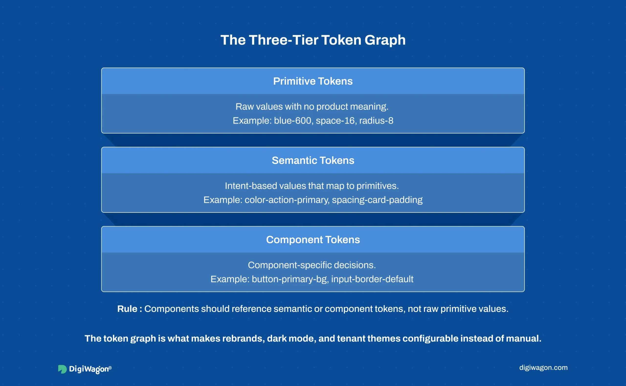
The discipline that matters: components never reference primitive tokens directly. They reference semantic tokens, which reference primitives. This indirection is what makes a new tenant theme, a dark mode, or a rebrand a change at the semantic layer rather than a sweep across every component.
A system with a clean three-tier token graph can re-theme in hours. A system with hard-coded values re-themes in weeks of manual edits and regression risk. The token graph is the single highest-leverage architectural decision in the whole system.
How Should You Classify Components: Primitive vs Composite?
Component count is a number teams love to report and buyers should ignore. What decides scalability is the classification discipline underneath the count. Brad Frost’s Atomic Design methodology (Frost, 2016) gives the vocabulary; production systems compress it to a workable two-tier split.
- Primitives. Single-purpose, composition-ready building blocks: button, input, checkbox, badge, icon, text. They hold no business logic and no layout assumptions. They are the most reused and the most stable.
- Composites. Assemblies of primitives that encode a recurring pattern: a data table row, a form field with label and validation, a filter bar, a transaction card. They carry layout and sometimes light interaction logic.
The classification rule with the highest payoff: a composite may only be built from primitives and other composites, never from raw markup. The moment a composite reaches past the system to hand-roll a button, the system has a leak. Enforced strictly, this rule means a primitive fix propagates everywhere automatically. Enforced loosely, primitives and one-off copies coexist and the system slowly loses authority.
For data-dense enterprise surfaces, the composite layer carries most of the value. Teams evaluating this for analytics-heavy products can see how SaaS platform engineering services account for component architecture alongside the underlying data model.
What Does a Figma-to-Code Sync Pipeline Actually Require?
This is where most design systems quietly fail. The Figma library and the code library start identical and drift apart the moment a designer tweaks a component in Figma and an engineer ships a different version in code. Within a quarter, neither side trusts the other.
A production-grade sync pipeline closes that gap structurally:
- Tokens as the shared contract. Design tokens are exported from Figma (via the Tokens Studio plugin or the native variables API) into a platform-agnostic JSON format, then transformed into platform-specific outputs (CSS custom properties, iOS, Android) by a build step. The token JSON is the contract both sides honour.
- Code as the source of truth for behaviour. Figma owns visual specification; the code library owns interaction behaviour and accessibility implementation. Documentation tooling like Storybook’s component-driven workflow (Storybook, 2024) renders the live code components so designers review the real thing, not a screenshot.
- Versioned releases, not continuous edits. The system ships on a release cadence with semantic versioning and a changelog, so consuming squads upgrade deliberately instead of absorbing silent breaking changes.
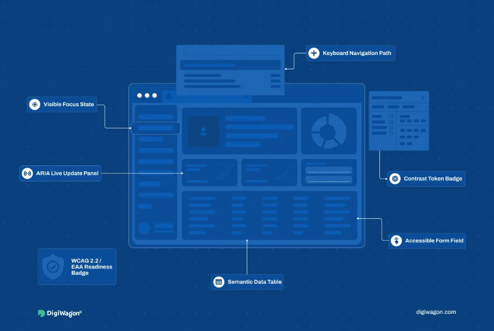
Accessibility belongs in this pipeline, not bolted on later. When primitives bake in WCAG 2.2 (W3C WAI, 2023) conformance, focus states, contrast ratios, and ARIA semantics, every composite inherits compliance for free. Retrofitting accessibility into 80 shipped components costs far more than designing it into a dozen primitives once.
Which Governance and Engagement Model Fits Your Team?
The pipeline is mechanism. Governance is the rules that decide who can change the system and how. Without it, the cleanest token architecture fragments under multi-squad pressure within two quarters.
A workable governance model defines three things: a contribution path (how a squad proposes a new component), a review gate (who approves it into the system), and a deprecation policy (how old components retire without breaking consumers). The model maps onto an engagement choice:
| Model | Best Fit | Trade-off |
|---|---|---|
| In-house systems team | 4+ squads, long product horizon | Highest cost, deepest institutional fit |
| External design partner | Foundation phase, capability gap | Fast standup, needs handoff plan |
| Hybrid (partner builds, in-house stewards) | Scale-up phase | Best velocity, requires clear ownership split |
The hybrid model wins most often for enterprise SaaS at the scale-up stage: an external partner architects the token graph, primitive set, and pipeline, while an internal steward owns day-to-day governance and contribution review. The trade-offs between external and in-house design ownership shift with product maturity, which is why the engagement decision is rarely permanent.
Building Your Design System With DigiWagon
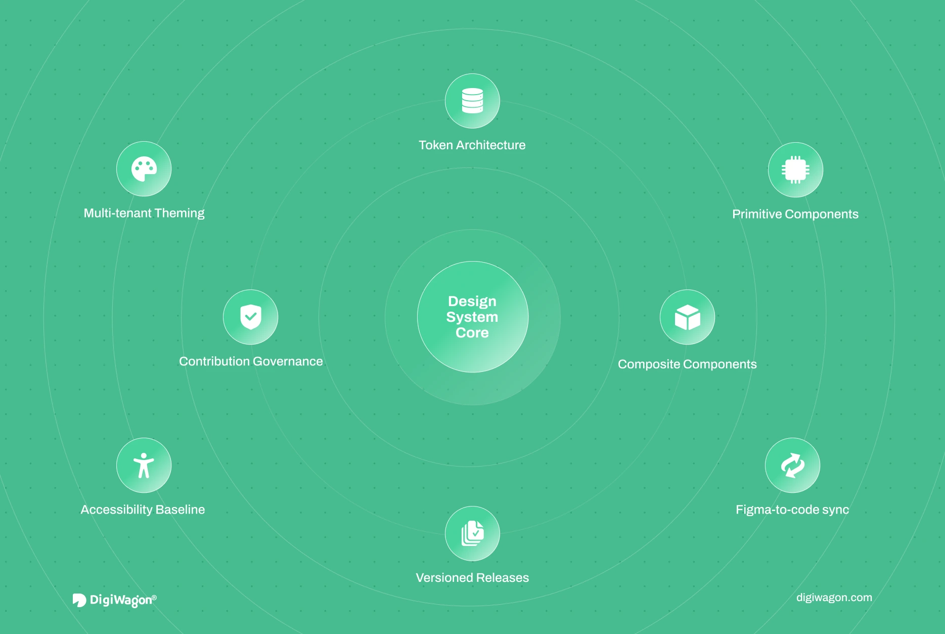
DigiWagon architects production-grade design systems for enterprise SaaS and regulated platforms, covering the full systems layer rather than a component library. Our work includes:
- Three-tier token architecture and multi-tenant theming
- Primitive and composite classification with contribution governance
- Figma-to-code sync pipelines with versioned releases
- Accessibility baselines baked into primitives at WCAG 2.2
This blog deepens the ownership decision from the four architectural decisions for enterprise UX. For the broader practice, see enterprise UI/UX design and engineering services and dedicated design system services.
See also why enterprise design systems fail at scale, and if you are unsure whether the product’s current interface is the problem, the free UX Audit Scorecard scores it in five areas before any system work starts.
Treating the Design System as Infrastructure
A design system earns the “production-grade” label through architecture, not through component count. The token graph decides how cheaply the system adapts. The primitive-composite split decides whether it scales or fragments. The sync pipeline decides whether design and code stay aligned or drift into mutual distrust. Governance decides whether it survives multiple squads. Build a hundred beautiful components without those four in place and the result is a gallery that rots. Get the four right with a dozen primitives and the system compounds in value every quarter it runs.