Executive Overview
- Poor UI design costs businesses up to 400% in lost conversions – this guide covers the 11 most common UI issues that drive users away.
- From unresponsive layouts to missing CTA feedback, each issue is explained with its business impact and a concrete fix.
- Includes a comparison table of UI issues by severity, a prioritization framework, and an FAQ section based on the most-searched UI questions.
- Updated for 2026 with insights on AI-driven UI, accessibility compliance, and mobile-first design patterns.
A UI issue is any flaw in a digital product’s visual interface – buttons, layouts, navigation, typography, or interactive elements – that creates friction, confusion, or frustration for the user. UI issues directly increase bounce rates, reduce conversions, and erode brand trust. They range from structural problems like poor responsiveness to interaction failures like missing CTA feedback.
You must have seen many unfriendly products in the market. Like the key lock of a door between the door handle. Or confusing buttons in the lift for operation. Even the unclear ways to symbolise males and females outside a public washroom are confusing.
Not only are these products user-unfriendly, but they also lead to the abandonment of products or rework to correct them. Such cases are also present in the online world. All these are examples of bad user interface (UI) design.
User interface means the smallest touch points users use to interact with the system or technology. Such UI issues affect users’ experience, leading to high bounce rates, which is costly for you. UI must be interactive, easy to learn and use, and visually attractive.
Therefore, it is essential for businesses to pay attention to the UI design of a website or app. A good UI design can lead to meaningful interactions and engagement of users with the technology, skyrocketing conversions. Thus, you must pay attention to UI best practices in the market and avoid common UI problems.
This article explores the critical UI problems and UI design best practices in detail.
What Are the Most Common UI Issues in 2026?
1. Absence of responsiveness
One of the most common UI problems is unresponsive design. It means the website does not look the same across different devices and screens. But businesses pay less attention to this UI issue.
A lot of users check websites on their mobiles. They do not have the time to open their laptops. So, it is crucial to have your website UI design aligned with mobile screen requirements. An unresponsive design destroys the users’ experience with the website, leading to customers closing it and looking for competitors’ websites.
Create a user interface with functionality and looks aligned with all devices’ requirements.
2. Complex navigation
When you open a website, you look for an easy path and smooth navigation. But some websites keep complex navigation that confuses the visitors. The website or app design is brilliant, but navigating across it is a huge UI issue.
The user must not get confused about where to go, what to click, and what to do. The website must be simple to travel through and understand what it is about. If the navigation is simple, visitors are more likely to take the expected action by clicking on the CTA.
3. Irrelevant or bad-quality images
Images are attractive and enable you to tell your story more effectively. But unnecessary images do not add value but rather decrease your credibility. Also, low-quality images might repel a visitor from your website. And the use of unrelated images is a common UI issue found on websites.
So, you must keep photos that add to your business story or relate to your offering. The images must convey the right message and create a belief in customers. Using smudged, fake, pixelated, or blurry images creates a bad impression.
4. Too much text
Content is crucial for any website. You cannot keep images and videos and expect to find customers. But having loads of content explaining too much of your offerings is a significant UI issue.
Generally, visitors do not read the content. They just run their eyes on the text to get an idea about your business. Too many words might distract or bore them enough to jump to another website.
A UI design best practice is to express in a few words. Use headings, subheadings, bullet points, boxes, and other elements to communicate your message. See to it that your words make sense, put relevant images and create emotional impact. The number of words is not the right measure of website success, but crisp, meaningful, and convincing content is.
Another UI problem is using demo or plagiarised content on your app or website. It is a complete no-no, as it reduces your business credibility.
5. Messy layout
Messy website layouts are frustrating to readers’ eyes. If you do not make a proper plan for the placement of several website elements, you give it a chaotic look. Visitors don’t know what to focus on and where to click to take action. The end result? Bounce rates go high.
So, a messy, cluttered, unplanned layout is a UI problem you cannot ignore.
Your content on the website must follow a visual hierarchy. You must consider all the elements you want to put on your website and make a plan for their placement, colour, and font. The text must be readable. Place website elements evenly on the page and in proper alignment to make sense.
A UI best practice is to have a clear, straightforward layout. It must look good, but you cannot overlook the substance while making it stylish. You must achieve visual harmony between all website elements to guide visitors easily.
6. Slow pages or application
How irritating it is when shopping on an eCommerce app, and page loading takes time! Few seconds of delay and the user bounces off the page and might not revisit it. This is a significant UI issue to ignore for any business. And you would not want to compromise your conversion or traffic for the website or application speed.
Whether it is laptop or mobile, slow pages or slow apps irk the users. Your search engine rankings go for a toss, and you also lose credibility.
The UI best practice is to mend the page or application speed. You might need to optimise images, reduce the use of plugins, or lessen HTTP requests.
7. Improper contrast
Contrast is a visual element on your app that needs to be correct for smooth viewing. An improper contrast leads to merged elements on the app, which gives it a plain look and feel. It gets difficult for the user to read, resulting in low usability of the app. The user might get confused if the primary and secondary action buttons look the same.
- Are users able to navigate through it?
- Is the content easy to understand?
- Is the website loading fast or slow?
- How is the website’s performance on mobile?
- Where are the CTAs directed?
- Are there any bugs?
It is vital for you to correct this UI issue to present a clear view to the user. You can put CTAs in high-contrast colours to attract visitors’ attention. It is also advisable to use different colours for different sections of the website – header, body, and footer. Pay attention to contrast and colour even while using text and images together.
8. Insufficient response on CTA
A common but overlooked UI problem is insufficient feedback on CTA. It means when the visitor clicks on the CTA, the app or website must give an appropriate response. For example, if a visitor clicks on ‘Book tickets online’, they must get a response like ‘Tickets booked’ or ‘Error’ or ‘Payment not processed’.
Insufficient response confuses the user. They are not sure whether the action went through or was rejected. They might take action again, leading to duplication. Or, they might leave the website on the checkout page, affecting your revenues. Whatever the case, it destroys the user experience.
So, you must make it a UI best practice to include feedback on CTA. This response must be immediate, appropriate, and easy to understand for the user.
9. Touch buttons on mobiles or tablets
You must have seen some websites where it gets challenging to take action as per the CTA. Either the CTA button is too small that it is not visible easily. Or, the options for possible actions are unclear. Or, the buttons are too touch-sensitive that even if you take your mouse there, it clicks. All these are frustrating for any user.
Therefore, you must pay attention to the buttons on mobiles, tablets, and laptops. Consider the average finger size to make clicking easy for any user. Also, the button size must be big enough to be visible on mobile screens with ease-of-click.
10. Unclear guidance on forms
Forms are an essential part of any website. Users use these forms to provide contact details, log in, sign up, check out, raise complaints, and other things. Unclear guidance on forms is a prevalent UI problem.
If these contact forms are unclear and confusing, website visitors might avoid filling them. They might leave the website, reducing your chances of conversion. So, it is vital to have proper guidance on these contact forms.
Forms must not be too lengthy. Give valid reasons for the inability of the user to log in with text and colour. Also, show the user’s progress in filling out the form.
11. No testing before the launch
Suppose you follow all the UI design best practices and launch your application. And it does not work, or the users have complaints about the user interface. This is because you forget to test the interaction design. Testing the user interface is one of the vital UI best practices.
You must check and test every single change in design, colour, font, text, navigation, and other elements. And one-time testing is not enough. You must test it on different devices and various search engines to check if it works. If not tested well and errors come up after launch, it might lead to a bad user experience.
How Do You Fix Common UI Issues? Best Practices
Before fixing anything, measure. Our free UX audit scorecard scores a product across the five areas below in about five minutes and tells you which one to fix first; the fixes that follow assume you already know where the friction is.
We must find solutions to all the above UI issues. Businesses must aim to make the user interface as convenient and smooth for users as possible. Since you know the UI problems, you must work well to avoid them. And to avoid them, you must adopt the following UI design best practices:
1. Know your target audience
An essential UI best practice is designing your UI according to your target audience’s needs. If your target audience is people above 60, you cannot use the Gen-Z terminology in your content. You must know their pain points and the problems you are trying to solve.
Yes, following the UI design trends and top management’s ideas is good. But a UI best practice is not to imbibe it totally because it might not please your users. So, listen to what your users want and expect.
You can do this with continuous research and discovery of your users’ experience with the application. Measure the users’ feedback and experience and change in them after altering the UI. This analysis lets you know what works and what doesn’t for your target audience.
2. Remove the clutter
Another critical UI best practice is removing every element that is unnecessary to the design and content. If an element distracts your website’s flow or confuses users, remove it. You do not want to clutter your website with so many elements that a user is repelled and leaves.
Avoid the following for clear, straightforward navigation:
- Too many buttons
- Many different colours
- Numerous unnecessary images
- Use of several fonts
- Too much text
Ensure to keep some negative space between elements to give a clear look to the website. Also, prioritise the placement of elements based on their value to user experience. Overall, check what elements draw your target audience’s attention and follow that. The placement of all navigation elements must align with the user’s expectations.
3.Keep innovating
Innovation is the key to every industry. Innovation and research have led to new trends and developments in any sector. Similarly, one of the crucial UI design best practices is creative innovation.
There are many design principles, standards, and rules to follow for UI designers. You can rely on these checklists for guidance on designing your UI. But blindly following them would be a big mistake.
You must check out the new trends, listen to your users, and use some discretion while designing UI. These rules must be your guidelines for UI designing, but you must think out of the box for effective and unique results.
Users want something unique besides simple, easy-to-navigate, and pleasant looks. So, your aim must be to give extra value to your users, which might be possible with a dash of creativity and innovation.
4. Test it enough
Manage sufficient testing of your application user interface to check if it responds immediately and operates smoothly. You must also check for bugs, navigation, and broken links. You must aim to correct the clickability, reachability, and usability of all website elements.
Also, your target audience would be using different devices to access your application. So, make your UI design responsive to all types of devices and all search engines. Check how the app or website functions on each device and the impact on the user journey. Check at what points they are getting stuck or facing technology glitches.
Before the application release, you must check the following:
- Functioning of the user interface
- Speed and load of the application
- Performance of forms, database, and cookies
- App security
- Navigation, design, and content quality
- Compatibility with different devices and browsers
Even after the launch, you must be ready for feedback and improvements based on that. You must not shy away from asking your actual users about their experience while using the application. Based on these reviews, you must improve further to enrich other users’ experience and gain lost customers.
UI Issues Severity and Priority Matrix:
| UI Issue | Severity | User Impact | Fix Complexity | Priority |
|---|---|---|---|---|
| Unresponsive Design | Critical | Immediate Bounce | Medium | P0 |
| Slow Page Load | Critical | 53% abandon >3s | Medium-High | P0 |
| Complex Navigation | High | User Confusion | Medium | P1 |
| Missing CTA Feedback | High | Failed Conversions | Low | P1 |
| Improper Contrast | High | Accessibility + Readability | Low | P1 |
| Small Touch Targets | Medium | Mobile Frustration | Low | P2 |
| Messy Layout | Medium | Cognitive Overload | Medium | P2 |
| Too Much Text | Medium | Scanner Fatigue | Low | P2 |
| Bad-Quality Images | Low-Medium | Credibility Loss | Low | P3 |
| Unclear Form Guidance | Medium | Form Abandonment | Low | P2 |
| No Pre-Launch Testing | Critical | Systemic Failure | High | P0 |
How can DigiWagon help you to solve UI Issues?
By knowing these common UI mistakes and UI best practices, you know what to do and what not to do. Apply these design principles to make the best possible user interface for your application and website. If you do not want to handle this stress or want an expert to manage the UI design, DigiWagon would be the right choice.
DigiWagon is a distinguished firm in the field of digital marketing, app development, web development and UI/UX design. We have been helping clients with our technically sound and aesthetically attractive designs. We pay attention to design rules and experiment a lot to give you the best results.
Our professional designers commit to achieving the expectations that you have set. We help you address your users’ needs and create the best user interface experience. Our UI design best practices give your users a simple and straightforward user journey path.
Builder’s Perspective
“At DigiWagon, we’ve seen firsthand how UI issues compound in high-stakes environments. When we built the C3 MedTech eye disease management companion, every UI decision – from contrast ratios for elderly patients to touch target sizing for clinical staff wearing gloves – had direct patient-safety implications. The lesson: UI isn’t cosmetic. In domains like healthcare and fintech, a single poorly-designed interaction can erode trust or cause real-world harm.”
How Have UI Issues Evolved in 2026?
AI-Generated Interfaces Without Validation: The rise of AI design tools has made it easy to produce visually polished interfaces quickly. However, 54% of designers report that stakeholders want to adopt AI-driven UI trends without clear use cases. Shipping AI-generated interfaces without usability testing creates a new class of UI issues – products that look professional but fail basic interaction patterns.
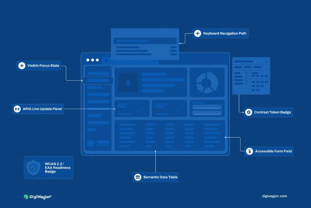
Accessibility as a UI Requirement, Not an Afterthought: In 2026, accessibility is no longer optional. Research shows that 71% of users leave sites that are difficult to navigate for people with disabilities. WCAG 2.2 compliance has become a baseline expectation, and UI issues like insufficient contrast ratios, missing alt text, and keyboard-inaccessible elements are now treated as critical defects.
Adaptive and Personalised Interfaces: Users increasingly expect interfaces that adapt to their behavior in real-time. 66% of consumers will disengage from a brand if their experience is not personalised. Static, one-size-fits-all UI design is becoming a competitive liability as AI-powered personalisation sets new expectations for interface responsiveness.