UI Design Fundamentals
A combination of the right elements of art and science makes a quality user interface. It’s not only colours or fonts or style or typography. It’s coming together of all these elements in the right amounts to lead to the best user interface for your website, device, or app.
User interface connects users and products/services. This connection must be strong, smooth, easy to use, as per users’ needs, attractive, familiar, logical, and must lead to the goal. To create such a user interface, you need to incorporate some basic UI Design Fundamentals, which we discuss in the below section.
In short: the fundamentals of UI design are user focus, simplicity, consistency, visual hierarchy, low cognitive load, feedback, flexibility across devices, minimalism, clear next steps, accessibility and testing. The sections below take each in turn, and a final section covers what has changed since this guide was first written.

Important fundamentals of user interface design
Keep the user at the centre of UI design
The user interface must be interactive, easy to operate, and attractive. These features will attract users to your product/service. Thus, whatever you are doing, your aim must be to address the users’ expectations and needs.
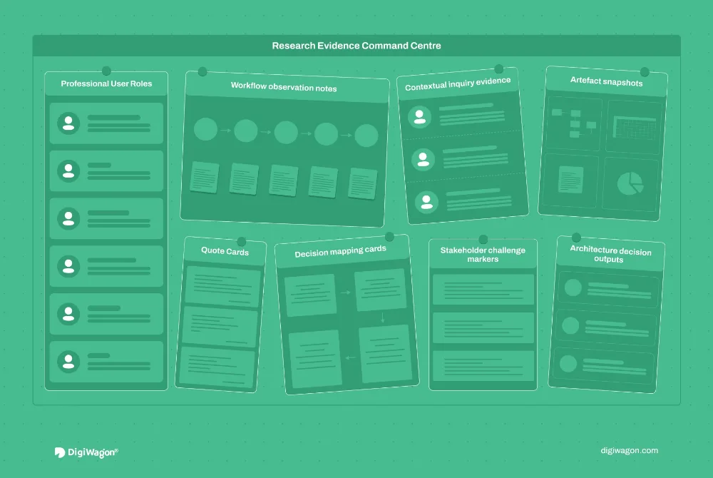
For this, you need to interview your customers. Know their expectations, desires, and requirements. Focus on the people side of your user interface design to get it right for the users.
So, understanding your targeted users is essential. Understand their preferences in terms of colours, fonts, styles, typography, calls to action, and usage. Keep them in mind always while designing the user interface, as it has to lead users to their end goals.
Keep it simple and clear
Too many features or too many design elements can cause distractions for your users. Avoid these. Instead, make your user interface design simple. The target audience must find it easy to use and work around it.
So, while adding design elements, consider whether it enriches or worsens the user experience. If it adds value to users’ interaction with the product or service, add it; otherwise, not. It should not confuse users or degrade the interaction process with the product or service.
Make it consistent for users
With consistency, your user interface design becomes predictable for the users. That means they just have to learn to use your product or service once. For all the subsequent times, they are aware of the steps because it remains the same.
When the user is more familiar with the interface, s/he finds it easier to use. Consistency leads to patterns that the user is familiar with, which s/he can just pick up and use anytime without help. So, keep the colour scheme, menus, language, navigation buttons, and other elements consistent to ensure users do not drift away.
Maintain a visual structure
There should be a well-defined visual structure of the interface. For example, in a website, try to have the same visual hierarchy on every page or screen. This gives consistency to the eyes of the user, who does not get distracted while interacting with the website.
Also, to the user, such visual structuring looks less complex. They feel more at home with such visual order, and their anxiety levels also go down. This also gives confidence to them in your product or service.
Minimise cognitive load of users
Make the user interface design in such a way that users do not have to think much. The products or services must look more manageable for the users to process. You can adopt some principles such as:
- Divide information or action into smaller chunks to make information processing smoother
- Keep the last call-to-action within three clicks so that the user doesn’t get bored by clicking multiple times
- Use some of the standard icons used across websites for identification, for example, contact numbers, email ids, bell icons, etc. People understand these icons immediately, so don’t change their representation to look innovative.
Have your interface communicate with users
Your interface must communicate with the users. This makes users’ process of working through the product or service an enjoyable experience.
So, for every action a user takes, you can send visual cues or messages to take them to the last step. If users make errors, the interface must send a warning to prevent them from moving ahead. In a way, users must know whether their actions will take them to the last step or if they are going in the wrong direction.
Such feedback by the interface can be in the form of audio, images, or any other form. This gives users a better-quality experience. They are more confident about their actions leading to the goal.
Improve its flexibility
Your users may use any platform to check your product or service. So, ensure that your user interface design works on all possible platforms your target audience may use. It must also look visually appealing on each platform. Users will be more satisfied with the flexibility of operating on different platforms.
Adopt minimalistic design
Many elements on the interface create confusion, which may lead to high bounce rates. The solution is to minimise the clutter. Try to identify the most critical information and retain that.
Keep only the required relevant components for your interface. Try to drive retrieval of information by users through familiar patterns. Develop clear, visible calls to action to take the user to the next step.
Help users reach the next step
Users use your product or service to achieve something. So, they need to know the new course of action.
A website or an app must state the next step for the user to reach their desired goal. If a user reads a blog and reaches its end, there must be an icon taking them to the next step. Something like ‘back to the top’ or ‘read related topics’ would work.
Design for accessibility from the start
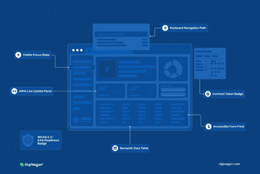
An interface that a fifth of users cannot operate is not a finished interface. Accessibility is now a legal requirement in many markets as well as a design one: WCAG 2.2 at level AA is the standard most regulations point to, and the European Accessibility Act has applied to many digital products and services since June 2025.
The fundamentals are practical: text contrast of at least 4.5:1, touch targets large enough for a thumb, visible keyboard focus, labels on every form field, alternatives for images and video, no information carried by colour alone, and motion that respects the user’s reduced-motion setting. Build these into the design system once and every screen inherits them.
Test your user interface
You cannot just design the user interface and make it available to a larger audience. Testing is essential. Gather a small set of users and ask them to use your interface to check whether they can use it or not.
Check:
- What types of instructions are they requiring?
- What are the loopholes in the design?
- What points do they need your help with?
- Are they able to reach the last step without any hassles?
- Are they confused, or can they easily sail through the interface usage?
Get answers to these questions to know where your user interface stands. With this feedback, you will be able to iterate and improve the interface.
What has changed in UI design fundamentals since 2022
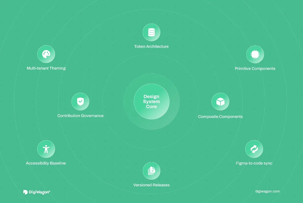
- Design systems and tokens. Colours, type, spacing and radii now live as named tokens shared by design tools and code, so consistency is enforced by the system rather than by review. Our guide to enterprise design systems at scale covers how to run one.
- Dark mode and user preferences. Interfaces are expected to honour the operating system’s colour scheme, text size and reduced-motion settings, which means designing states rather than a single screen.
- AI-assisted tooling. Generators can draft layouts and copy in seconds. That makes the fundamentals more important, not less: an AI-generated screen still has to pass the tests of clarity, hierarchy, feedback and accessibility, and someone has to apply them.
- Accessibility as a baseline. WCAG 2.2 and the European Accessibility Act moved accessibility from a specialist review to a design fundamental, as the section above sets out. The accessibility-first UX playbook goes deeper.
Concluding thoughts
These are the fundamentals of UI design. Make sure to put them into practice to deliver users what they need and expect. Use a solid approach that combines these fundamentals and gives users satisfaction.
With the right team and stakeholders, you can satisfy most of your users with the user interface design. Keep debugging and fine-tuning to make it as close to perfection as possible. If you need any help with the user interface or user experience, you can contact DigiWagon Technologies.
DigiWagon’s UI/UX design services apply these fundamentals to web, mobile and enterprise software, from research and wireframes to a design system your engineers can build from. If you want to know where an existing product stands before redesigning it, our free UX audit scorecard scores it across five areas in about five minutes.