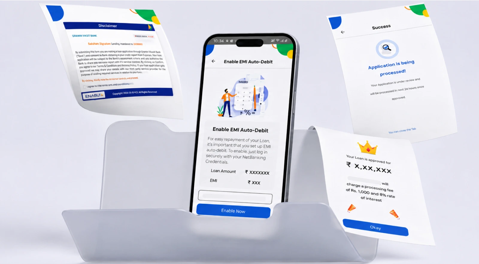
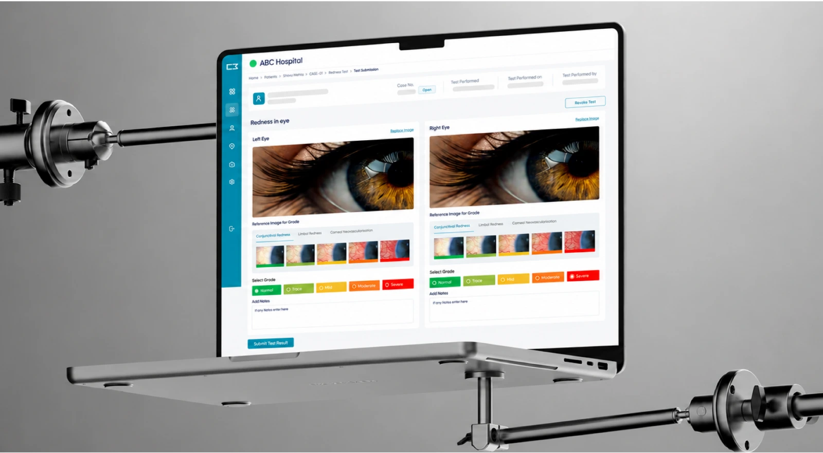
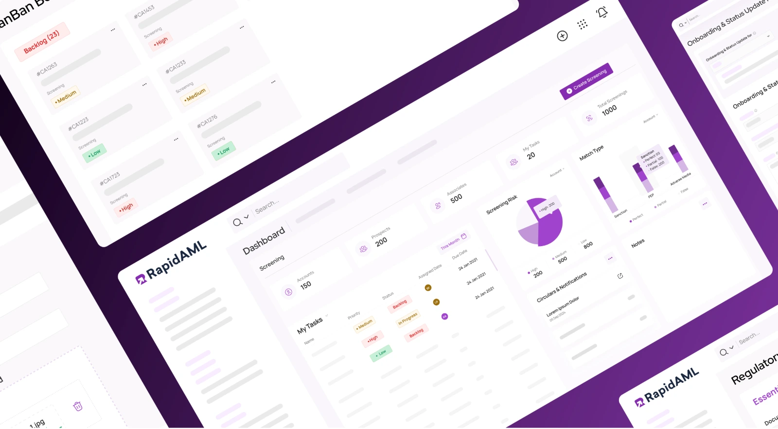
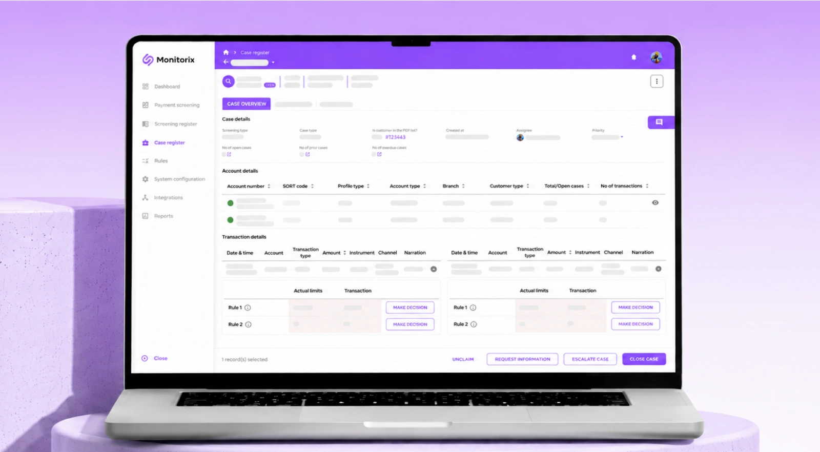
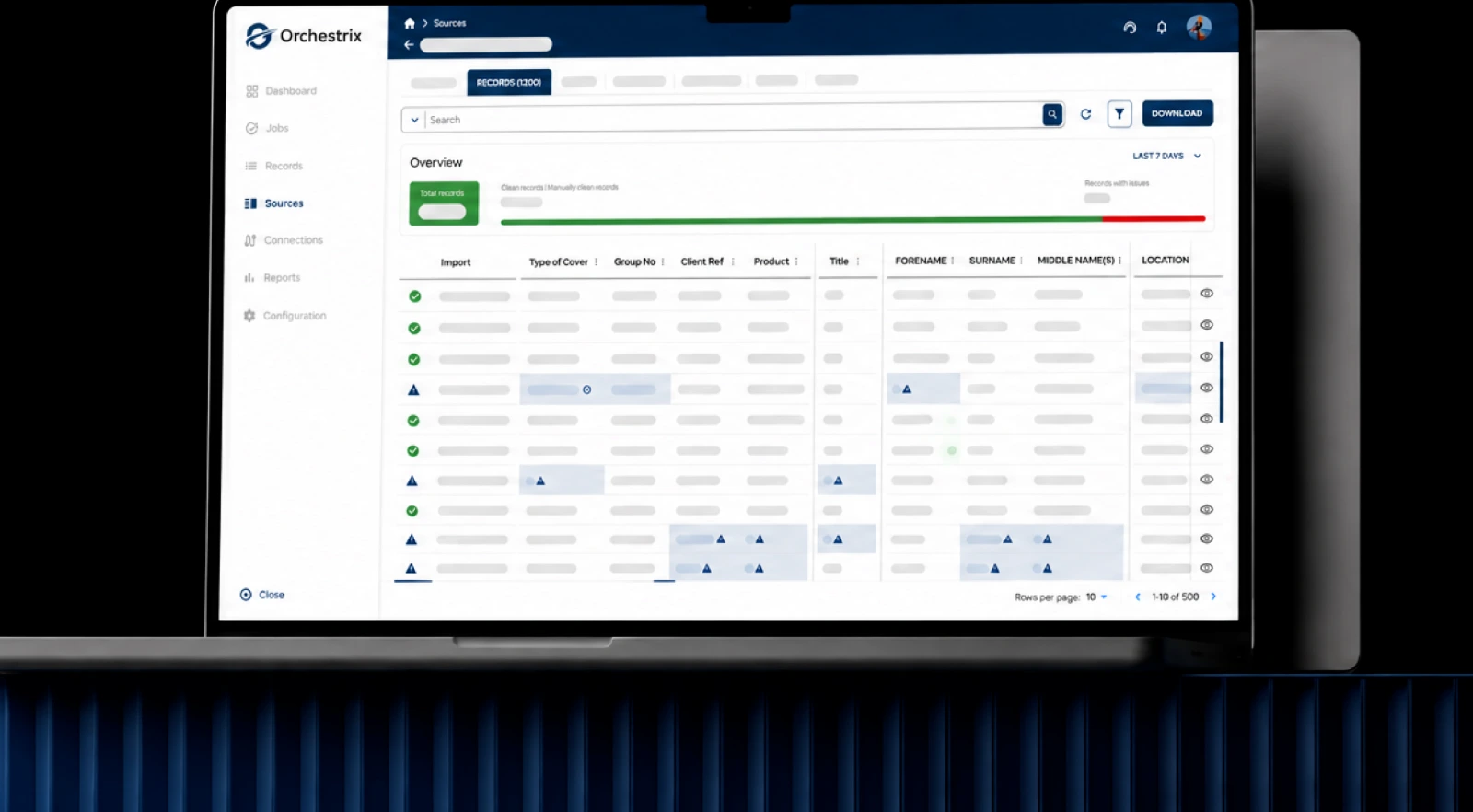
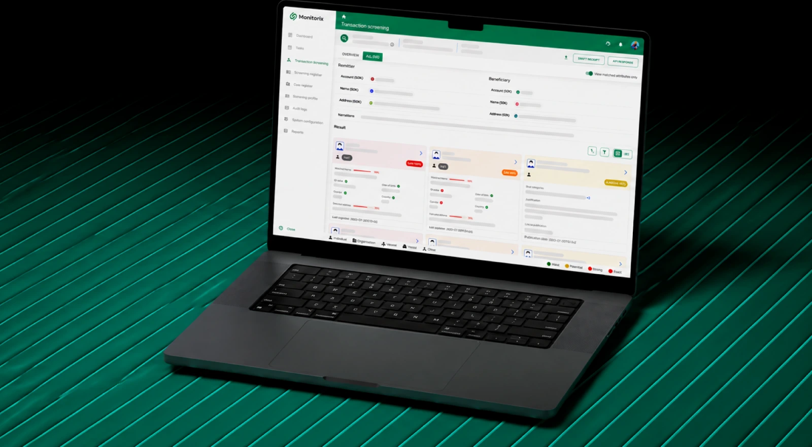
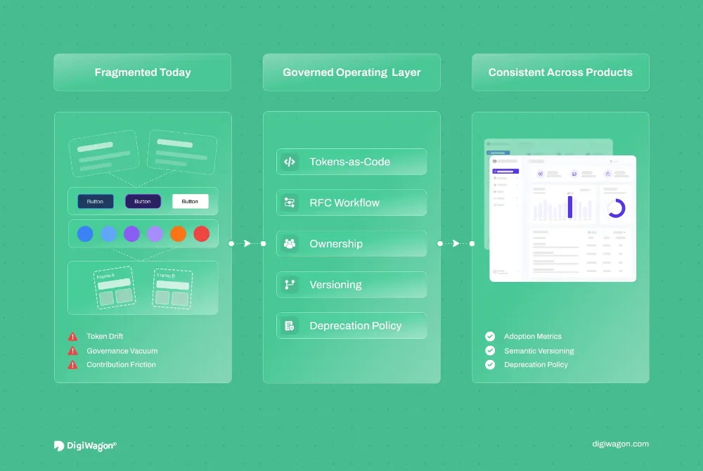
Shape user flows, information architecture, interfaces and design systems around real tasks so the experience is easier to understand, and the final design is ready for engineering.
Pick the situation closest to yours. We’ll show what we would design for it and where that sits in the capabilities below.
Pick where users slow down
Where they slow down
People Cannot Find What They Came For
The feature exists, and nobody reaches it. Navigation, labels and hierarchy grew a screen at a time and now describe the org chart rather than the task.
What we would design
What you could end up with
Flows built around the tasks people actually come to complete
An information architecture organised by task rather than by team
Navigation and content hierarchy that survive the next ten features
What it works with
What your users are trying to get done, in their words
The screens they abandon or ask for help with
The structure you already have, and what is load-bearing in it
A flow is being decided in review meetings from static screens, everyone is picturing something slightly different, and the disagreement only resolves after it is built.
What we would design
What you could end up with
Wireframes that settle structure before anyone argues about visual detail
Interactive prototypes that show how a journey behaves, not how it looks
Interaction decisions tested as behaviour rather than described in a document
What it works with
The one or two journeys that carry the most risk
Whoever has to sign the flow off, early rather than at the end
Real content and real edge cases, not placeholder text
An admin, an analyst and a customer all land on the same interface with different permissions and different questions, and it currently reads as one dense screen for all of them.
What we would design
What you could end up with
Interfaces that stay readable as roles, data density and devices change
Dashboard and web application screens designed for the decision, not the dataset
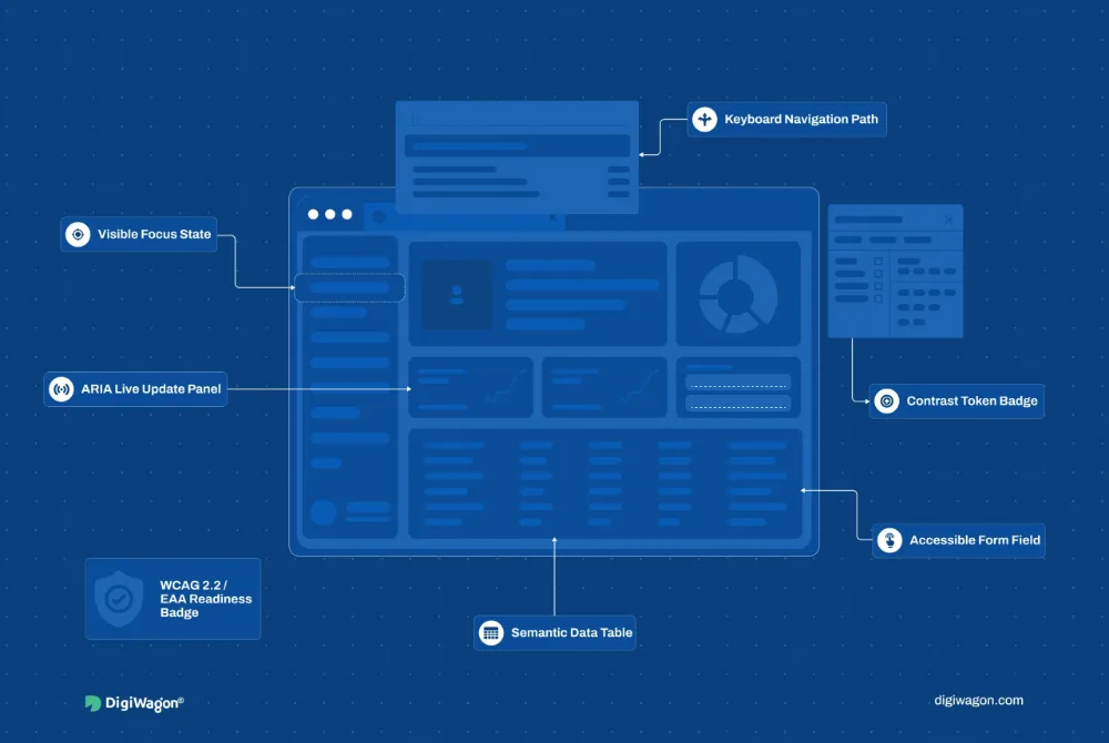
Accessibility considered as the screens are drawn rather than audited afterwards
What it works with
Every role that uses the screen and what each one needs from it
The states nobody designs — empty, loading, partial, failed
The devices and screen sizes this actually gets used on
Spacing, states and components drift between the file and the release, every screen is interpreted slightly differently, and the same conversation happens on the next feature.
What we would design
What you could end up with
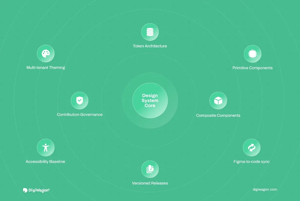
A component library and design tokens both design and engineering build from
Interaction states and responsive behavior defined before handoff, not during it
Documentation that makes the standard implementation the quickest one
What it works with
The components already in the codebase, however inconsistent
How design and engineering hand work over today
The features shipping next, so the system proves itself on real work
We work through the structure, flows, interactions and visual details that shape how people experience the product, with each decision connected back to what users need to do.
01
User Flows & Information Architecture
Define how people move through the product and how information should be organised around the tasks they need to complete.
User Experience DesignUser FlowsInformation ArchitectureNavigationContent Hierarchy
02
Wireframes, Prototypes & Interaction Design
Work through ideas before committing to final screens, using prototypes to test how key journeys and interactions should behave.
Design web, mobile and product interfaces that stay clear across different roles, devices and levels of complexity.
User Interface DesignWeb Application DesignMobile App DesignDashboard DesignAccessibilityWCAG 2.2 Considerations
04
Design Systems & Developer Handoff
Create reusable components, patterns, and documentation that help the product stay consistent as it grows and make implementation easier for engineering teams.
AI can change the way people move through a product. Instead of adding another feature on top of the interface, we design interactions that help users find information, complete tasks, and act with less effort while keeping important decisions clear and controllable.
01
Search → Ask
Let users move beyond menus and filters when a direct question can get them to the right information faster.
ExampleAsk, “Show high-risk applications pending review,” and open the relevant view with the right filters already applied.
02
Enter → Assist
Reduce repetitive input by using AI to suggest, pre-fill or organise information where the user should not have to start from scratch.
ExamplePre-fill known application details while leaving important fields for user review and confirmation.
03
Read → Understand
Help users make sense of dense information by surfacing summaries, exceptions, and the details that need attention first.
ExampleTurn a long case history into a concise summary with key risks and unresolved items highlighted.
04
Navigate → Next Action
Use context to surface relevant actions, so users spend less time working out where to go next.
ExampleAfter reviewing a case, present the most relevant next steps such as Approve, Request Information, or Escalate.
We work from the task rather than the screen, prove the risky journeys as prototypes before they become final designs, and hand over enough detail that engineering is not left interpreting intent.
01
Map the Tasks
Start from what people are actually trying to complete: the journeys, the decisions inside them, and where the product currently makes either harder than it needs to be.
Focus
TasksJourneysStructureFriction
02
Prototype the Risk
Work the uncertain flows out as wireframes and interactive prototypes, so interactions are tested as behavior rather than argued about as static screens.
Focus
WireframesPrototypesInteractionsReview
03
Design the Interface
Take the settled flows into web, mobile and dashboard screens that stay readable across roles and devices — including the empty, loading and error states nobody asks for.
Focus
ScreensHierarchyStatesAccessibility
04
Hand It Over Whole
Ship components, tokens, interaction states and implementation notes together, so what gets built is what was designed and the next feature starts from the same system.
Focus
ComponentsTokensDocumentationHandoff
Map01 Map the TasksPrototype02 Prototype the RiskDesign03 Design the InterfaceHand Off04 Hand It Over Whole
Insights
Thinking Behind the Interface.
Field notes on design systems, usability and the interface decisions that decide whether a product feels obvious or merely finished.
Experience Design
Accessibility-First UX: A Field-Tested Playbook
· Pavan Chavda · 9 min read
Experience Design
Production-Grade Design Systems: An Architecture Guide for Enterprise SaaS
· Pavan Chavda · 7 min read
Experience Design
Why Your Enterprise Design System at Scale Fails (And How to Fix It)
Straight answers on the difference between UI and UX, what UX design services actually include, how design quality gets measured, and what to expect from a UI/UX design agency at handoff.
01What is the difference between UI and UX?
UX focuses on how the product works for the user, including journeys, information architecture, task flows and usability. UI focuses on how those interactions are presented through layout, visual hierarchy, components and interface states. Strong digital products need both working together.
02What do UX Design Services include?
UX Design Services can include user flows, information architecture, wireframes, interactive prototypes, web and mobile interface design, dashboard design, design systems, accessibility reviews and usability improvements. The exact scope depends on the product, its users and where the current experience needs attention.
03How do you measure whether a design is working?
Design quality can be evaluated through usability testing, task completion, user feedback, behavioral data, heuristic evaluation and accessibility checks. The right measures depend on the product goal, whether that is reducing drop-off, simplifying a task or making a complex interface easier to understand.
04How do you make UI/UX designs ready for development?
We define responsive behavior, component states, interaction patterns, design tokens and implementation notes before handoff. Designers and engineers can also review complex interactions together, so the final product stays closer to the design intent and requires less interpretation during development.
Is Your Product Making Users Work Too Hard?
If key journeys feel complicated, inconsistent, or difficult to navigate, we can help rethink the experience and define what should change first.
One click opens the assistant you already use with a question that points it at this page, so the answer comes from what we publish, not a guess.
The question it opens withRead https://digiwagon.com/ui-ux-design-services and explain how DigiWagon runs a UI/UX Design Services engagement, what I should expect in the first 90 days, and how to judge whether a partner like this fits a team of our size. Stick to what the page says and mark anything you are not sure about.