The Core Problem with Legacy Dashboard Redesigns
- Dashboard redesigns fail when they break the muscle memory of power users who have spent years building speed on the old system.
- Information density is a feature for power users, not a problem to solve. Removing visible data “to simplify” will be rejected by users who need 15+ data points on one screen.
- A phased migration model with user-controlled opt-in reduces adoption resistance compared to a forced switchover.
- Run a design audit before redesign to separate workflows users actually rely on from features that exist but are rarely touched.
What Is a Legacy Dashboard Redesign?
A legacy dashboard redesign is the process of modernising an existing data-heavy interface, typically 5 to 15 years old, while preserving the workflows, data visibility, and interaction speed that current users depend on. It differs from a greenfield dashboard build in one critical way: you are designing against an installed base of trained users, not for an imaginary ideal user. The constraint is not “what would be best?” but “what can change without breaking the way people actually work?”
Why This Matters in 2026
62% of organisations still rely on legacy software systems, according to a 2025 Saritasa survey of over 500 IT professionals. In manufacturing, the number feels conservative. Most production dashboards were built before mobile browsers were a serious consideration, and they show it.
The gap is widening fast. German and UAE manufacturers are spending heavily on Industry 4.0 infrastructure: IoT sensor networks, predictive maintenance engines, real-time quality analytics from computer vision. But the data these systems generate has to surface somewhere. Right now, “somewhere” is a dashboard built in 2014 that cannot render on a tablet, refreshes every 90 seconds, and requires a developer to add a new column. The intelligence layer is 2026. The presentation layer is 2014. Every month that gap stays open, the smart factory investment underperforms because the people making floor-level decisions cannot access the data at the speed they need it.
What Makes Power Users Different from Regular Users?
In a manufacturing context, “power users” are not tech enthusiasts. They are factory floor managers, production planners, and shift supervisors who interact with the dashboard 6 to 10 hours per day, five or six days per week.
Speed over aesthetics. A power user does not care if the button has rounded corners. They care if the button is in the same place it was yesterday. They have developed keyboard shortcuts, memorised tab orders, and built spatial memory for where data lives on screen. Moving elements, even to “improve” them, destroys hours of accumulated motor learning.
Information density as a feature. A floor manager monitoring production output across 8 lines needs to see all 8 simultaneously. A redesign that shows one line at a time with a card-based layout will be dismissed as “unusable” within the first shift.
Workarounds as signals. If users have built spreadsheets that pull data from the dashboard, or taped printouts of reference data next to their screens, those are not signs of incompetence. They are signs that the current interface is missing something. Map those workarounds before you start redesigning.
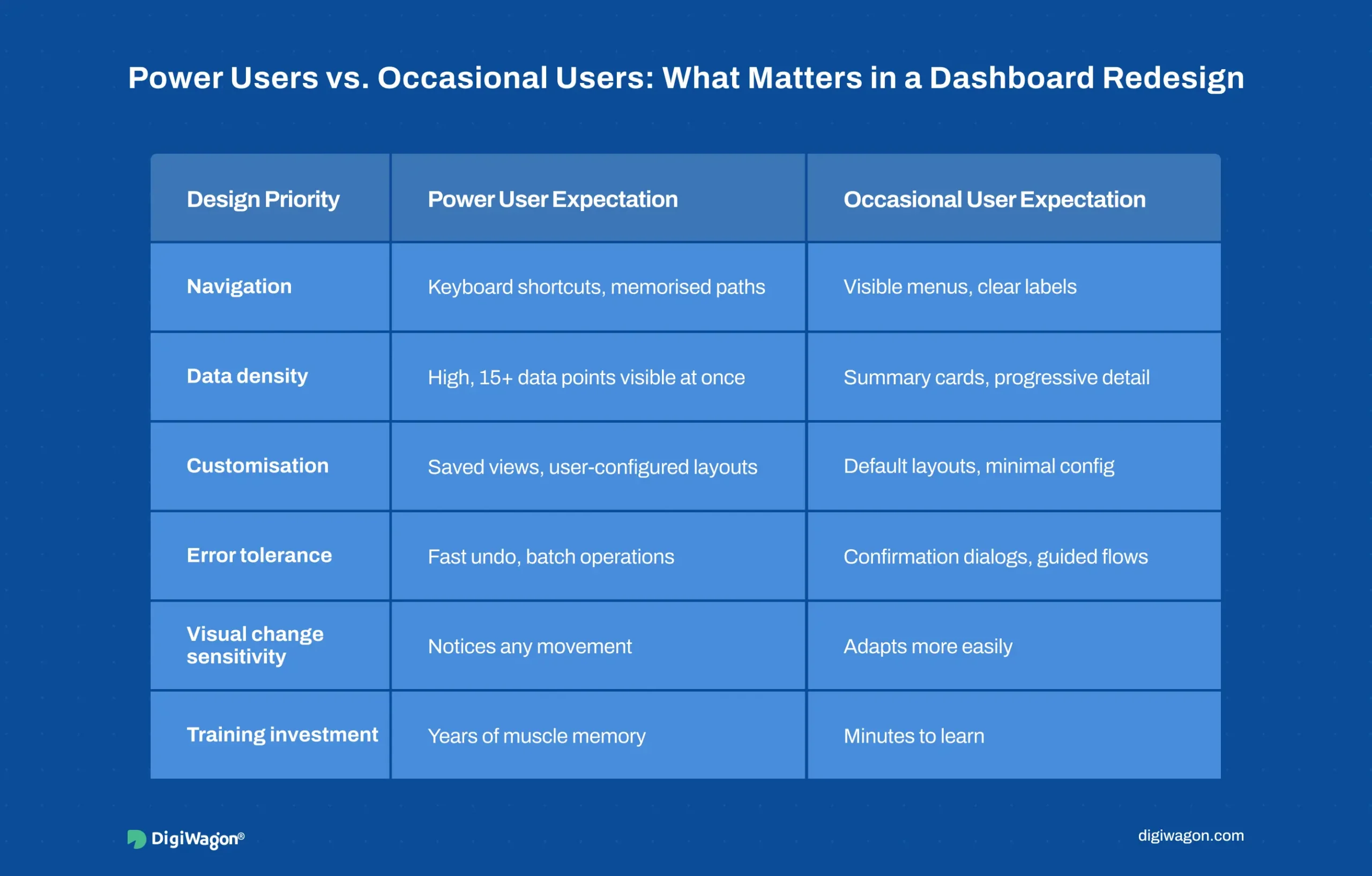
Power Users vs. Occasional Users: Design Priority Matrix
| Design Priority | Power User Expectation | Occasional User Expectation |
|---|---|---|
| Navigation | Keyboard shortcuts, memorised paths | Visible menus, clear labels |
| Data density | High, 15+ data points visible at once | Summary cards, progressive detail |
| Customisation | User-configured layouts, saved views | Default layouts, minimal config |
| Error tolerance | Fast undo, batch operations | Confirmation dialogs, guided flows |
| Visual change sensitivity | High, notices any element movement | Low, adapts to new layouts quickly |
| Training investment | Years of accumulated muscle memory | Minutes to learn, low switching cost |
What Interaction Design Patterns Preserve Power User Speed?
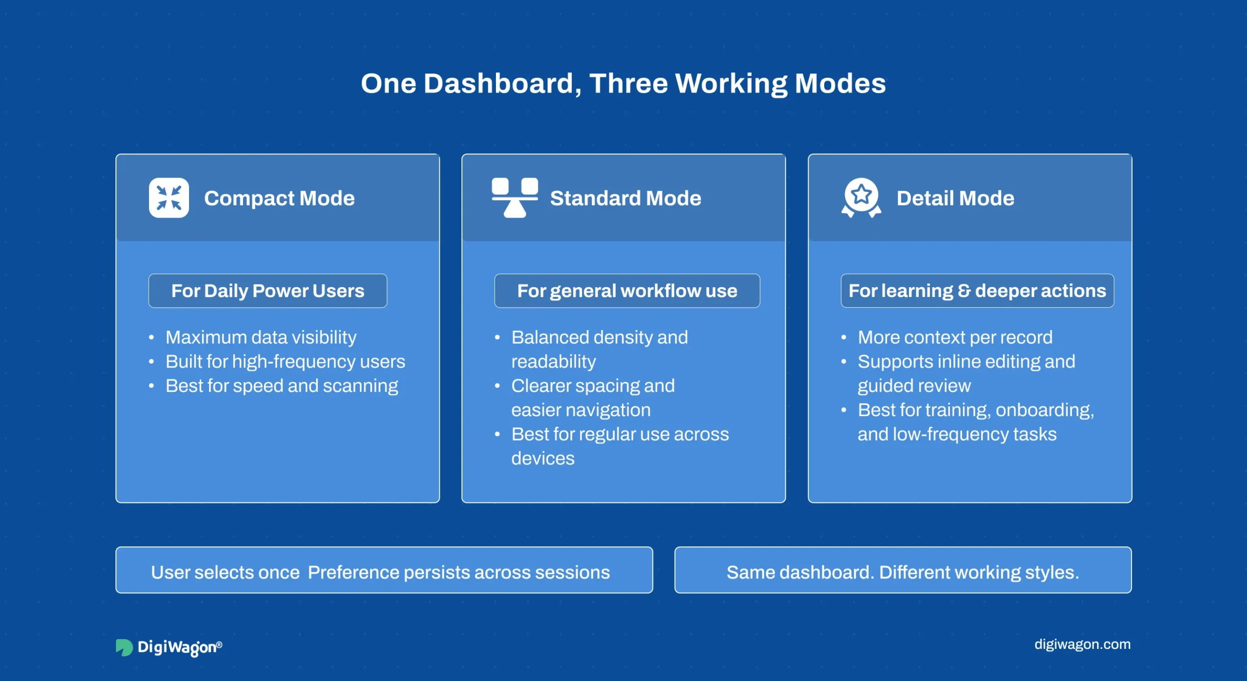
The goal of interaction design for complex interfaces is not to simplify the interface. It is to organise complexity so that information is accessible without hunting for it.
Progressive disclosure without data loss. Show the most critical metrics on the main grid. Detail panels expand inline (below the row, not on a new page) so context is never lost. The main grid stays visible throughout.
Keyboard-first navigation. Tab order follows the logical workflow sequence, not the visual layout. Arrow keys navigate between data rows. Hotkeys for the 5 most common actions (filter, export, drill-down, refresh, acknowledge alert) are persistent. A command palette (Ctrl+K) provides searchable access to any screen or action.
Persistent filter and view state. If a manager sets a filter to “Line 3, Current Shift, Defect Rate > 2%”, that filter should persist across sessions, survive browser refreshes, and be shareable as a URL.
Inline editing over modal forms. When a shift supervisor needs to update an operator assignment, they should click the cell and type, not open a modal dialog. Every unnecessary modal is a context switch. Inline editing with auto-save and undo (Ctrl+Z) respects the speed of users making decisions while standing on a factory floor.
How Should You Phase a Legacy Dashboard Migration?
A forced cutover, where the old system is turned off and the new one is turned on, is the riskiest approach for internal tools with trained power users.
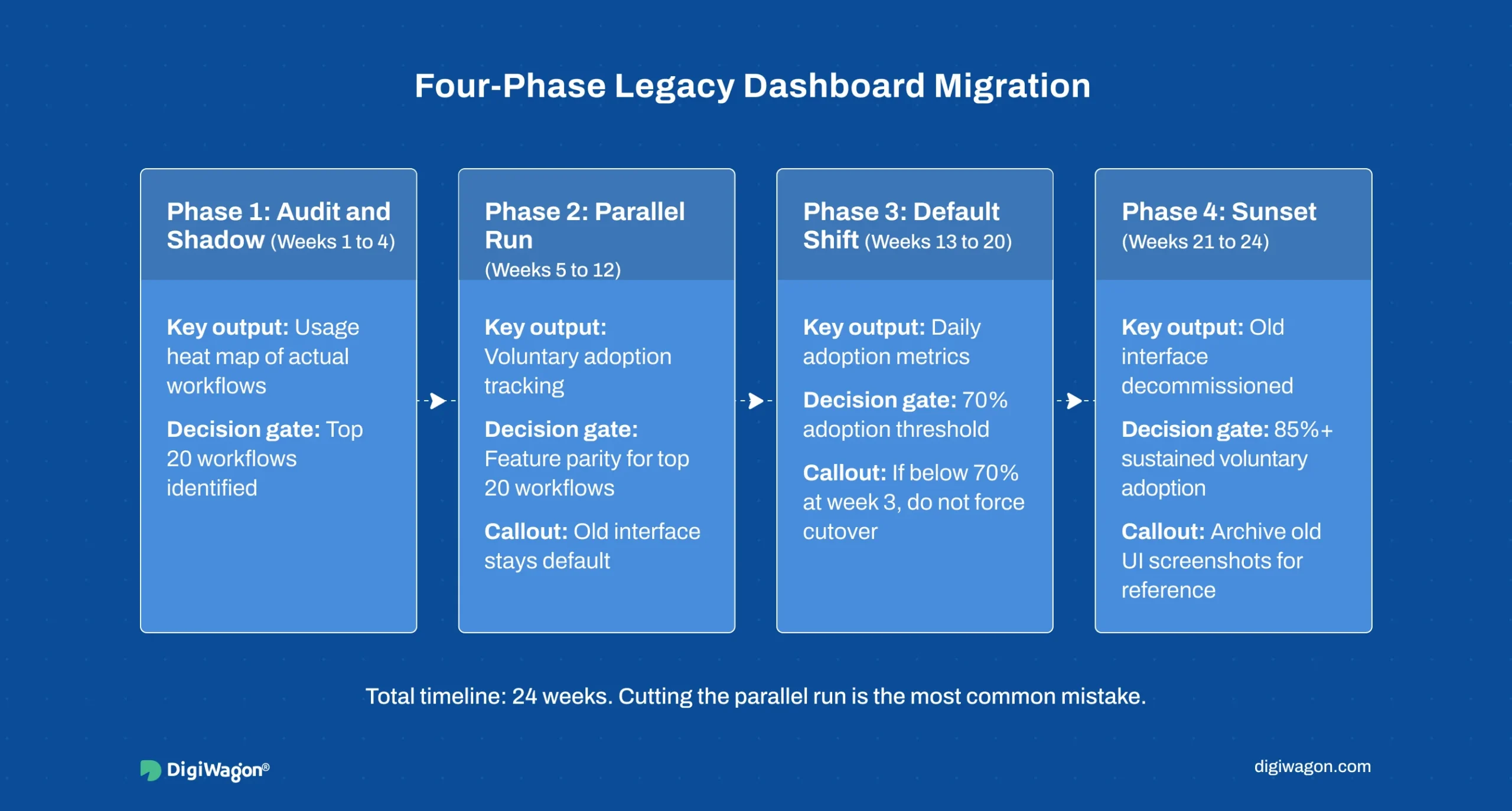
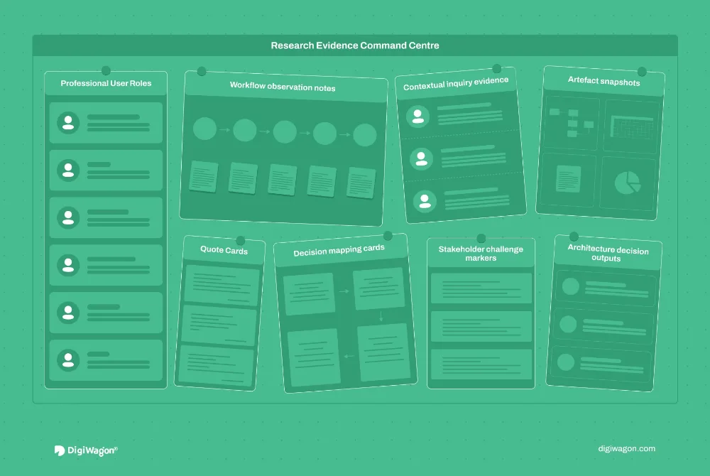
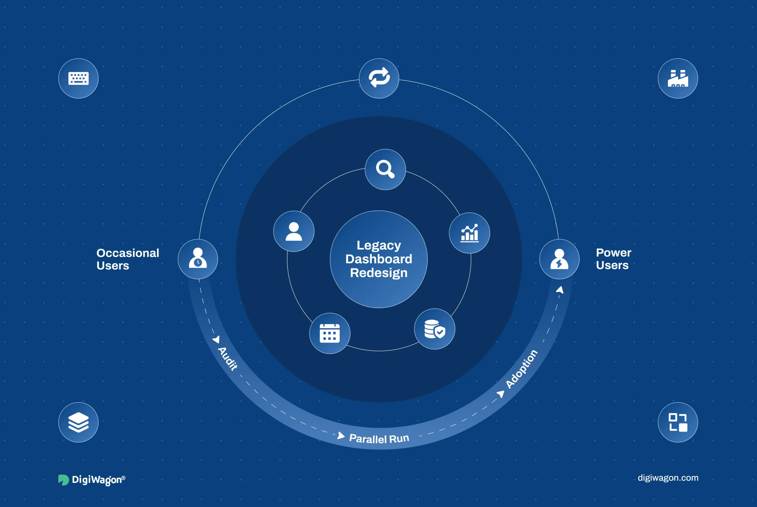
Phase 1: Audit and shadow (weeks 1 to 4). Install analytics on the existing dashboard to map actual usage: which screens get the most views, which filters are applied most often, which features have zero engagement. Conduct contextual interviews at the user’s workstation, not in a meeting room. The output is a usage heat map that tells you where to invest redesign effort and where to leave things alone. For a deeper look at this audit process, see our guide to design audit and usability testing ROI in legacy enterprise software.
Phase 2: Parallel run (weeks 5 to 12). Deploy the new interface as an opt-in alternative. Users switch between old and new with a single toggle. The old interface stays as the default. Feature parity for the top 20 workflows is non-negotiable before launching this phase. Missing even one gives users a reason to stay on the old interface permanently.
For teams planning this kind of migration alongside B2B eCommerce UX improvements, the same phased approach applies: parallel deployment with measured adoption beats forced switchover every time.
Phase 3: Gradual default shift (weeks 13 to 20). Switch the default to the new interface but keep the old one accessible. Track adoption metrics daily. If adoption drops below 70% after three weeks, do not force the cutover. Investigate which workflows are driving users back and fix them.
Phase 4: Sunset (weeks 21 to 24). Decommission the old interface only after sustained 85%+ voluntary adoption. Archive screenshots and documentation.
Dashboard Redesign on the Factory Floor
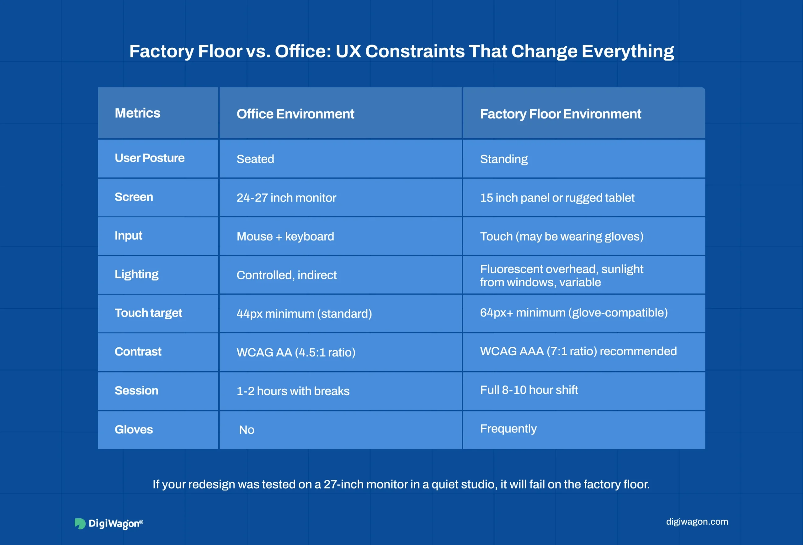
General dashboard design advice assumes an office: a seated user, a large monitor, a quiet room, a mouse. Manufacturing environments break every one of those assumptions.
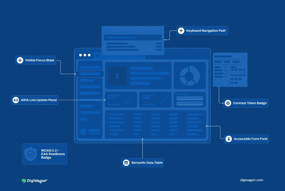
Production dashboards are used in noisy facilities where users stand for hours, sometimes wearing gloves. Screens compete against overhead lighting and warehouse sunlight. Touch targets need to be larger than office UI standards. Contrast ratios need to exceed WCAG minimums because ambient light washes out low-contrast elements. If your redesign was tested on a 27-inch monitor in a quiet design studio, it will fail the first time a shift supervisor tries to read it on a 15-inch panel under fluorescent lights.
The legacy dimension makes this harder. In many mid-sized manufacturing companies, the production management system was built by a single developer who left years ago. The system works. It is fast. It is also unmaintainable, impossible to integrate with modern IoT data streams, and visually stuck in 2012. According to Rockwell Automation’s State of Smart Manufacturing report, 89% of manufacturers in Germany expect to use AI and machine learning for advanced analytics. Those analytics need a presentation layer, and in most factories, that layer is a decade-old dashboard rendering tables in monospace font.
Workforce diversity adds another layer. In regions with internationally mixed teams, a single dashboard may need to serve managers who read English, Arabic, and Hindi. That means bidirectional text layouts, locale-appropriate date and number formatting (DD/MM/YYYY vs. MM/DD/YYYY, comma vs. period as decimal separator), and iconography that communicates across language barriers. This is not a nice-to-have localisation pass. It is a core architectural decision that affects component layout, data table alignment, and navigation direction.
Planning Your Legacy Dashboard Redesign with DigiWagon
DigiWagon’s design team builds interaction design for complex interfaces where data density and user speed are non-negotiable.
- Usage audit and power user workflow mapping
- Phased migration architecture with parallel deployment
- Configurable data density controls for mixed-expertise teams
- Factory floor UX testing (touch targets, contrast, environmental conditions)
Request a 30-minute dashboard assessment call, or start with the free UX Audit Scorecard to see which of the five areas your current dashboard is weakest in.
Conclusion: Redesign Legacy Dashboards Without Slowing Power Users
A legacy dashboard redesign should improve clarity without disrupting expert workflows.
Key takeaways:
- Keep high-frequency actions fast and easy to access.
- Do not hide critical data just to make the UI look cleaner.
- Redesign around real workflows, not only visual layout.
- Preserve useful complexity while improving hierarchy and scanability.
- Test changes with actual power users before rollout.
The goal is simple: make the dashboard feel modern without making experienced users slower.
Related reading: embedded analytics vs standalone BI, why BI dashboards fail and production-grade design systems for enterprise SaaS.